services
Creative Direction
client
credits
Kaizen Visual Identity
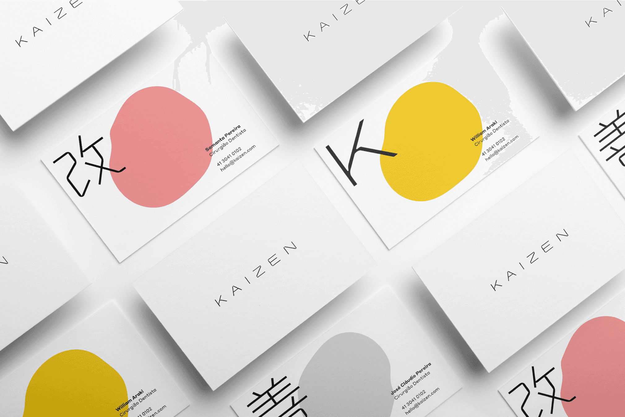
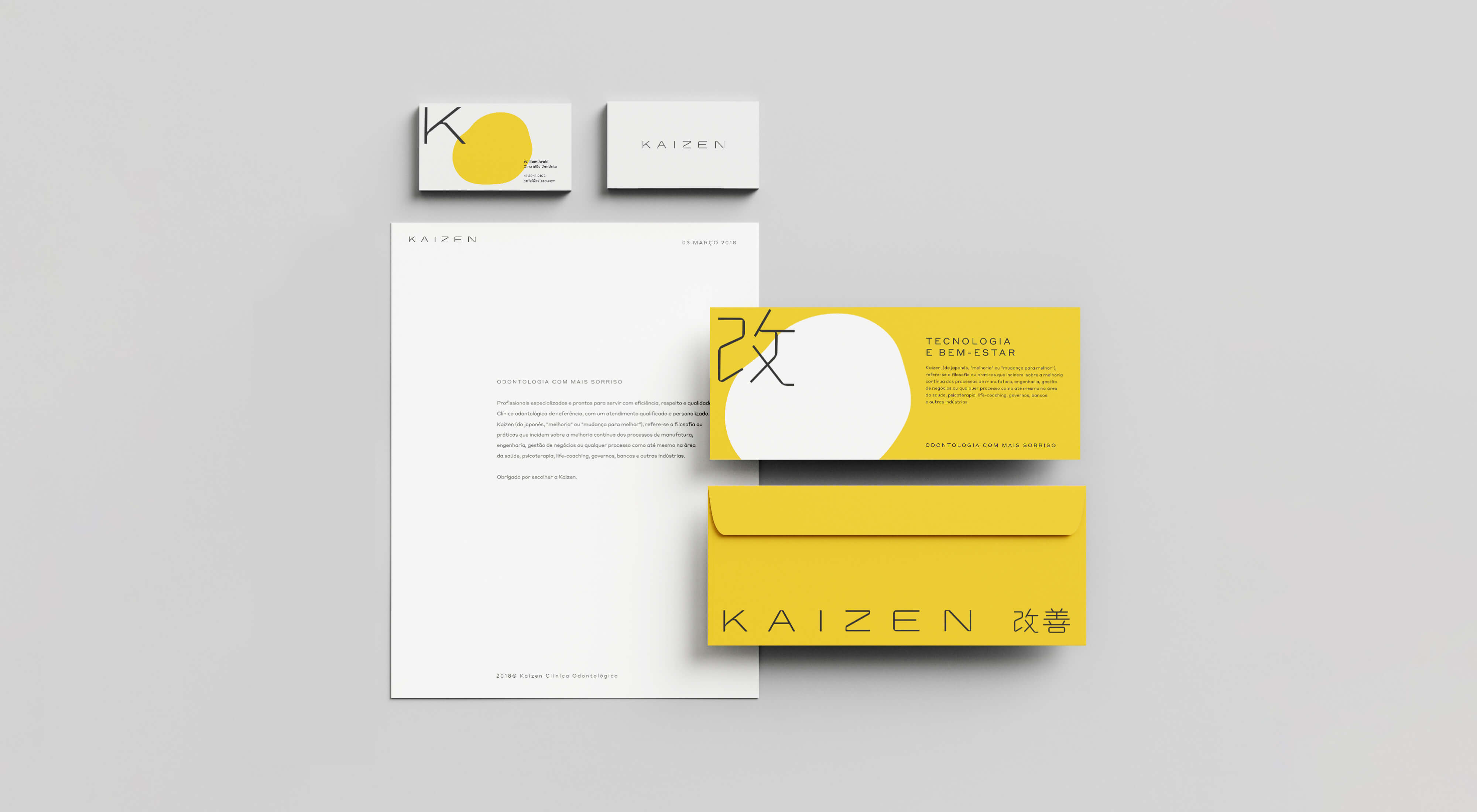
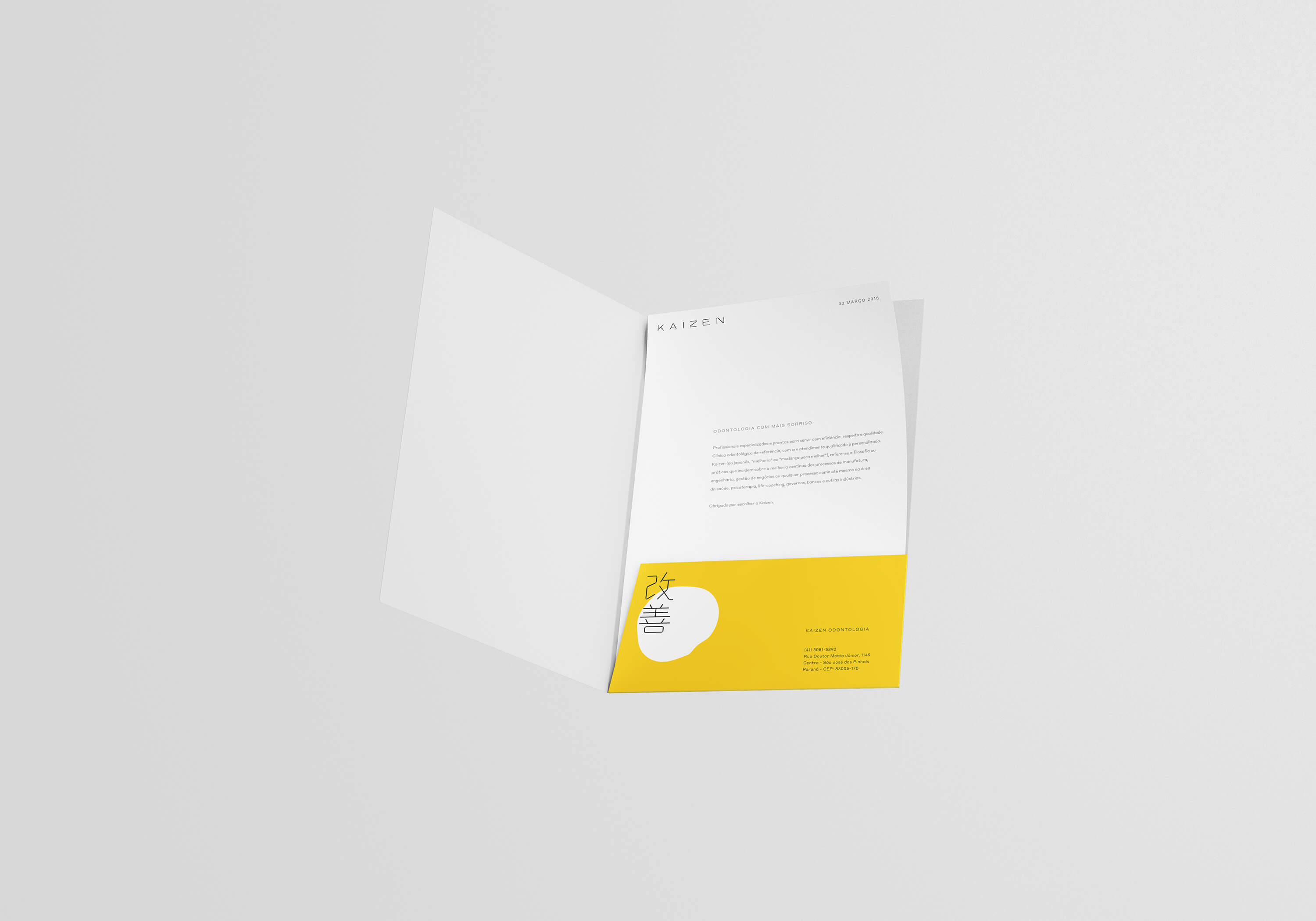
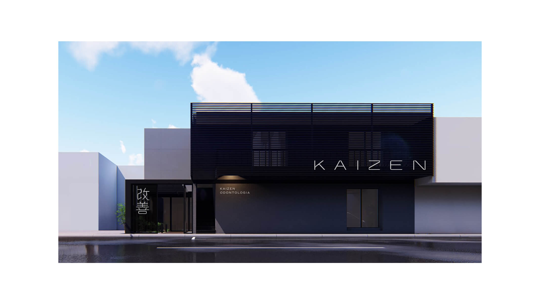
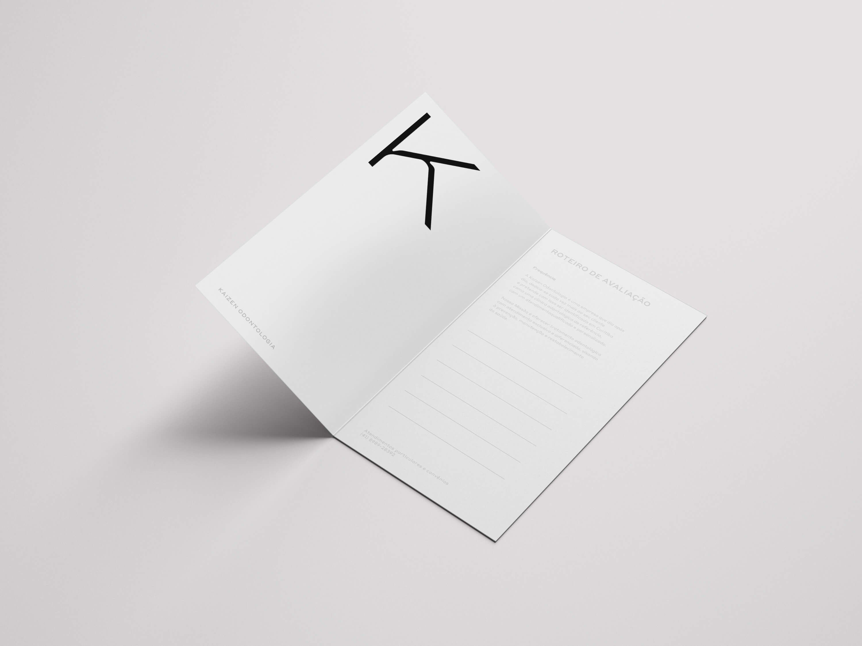
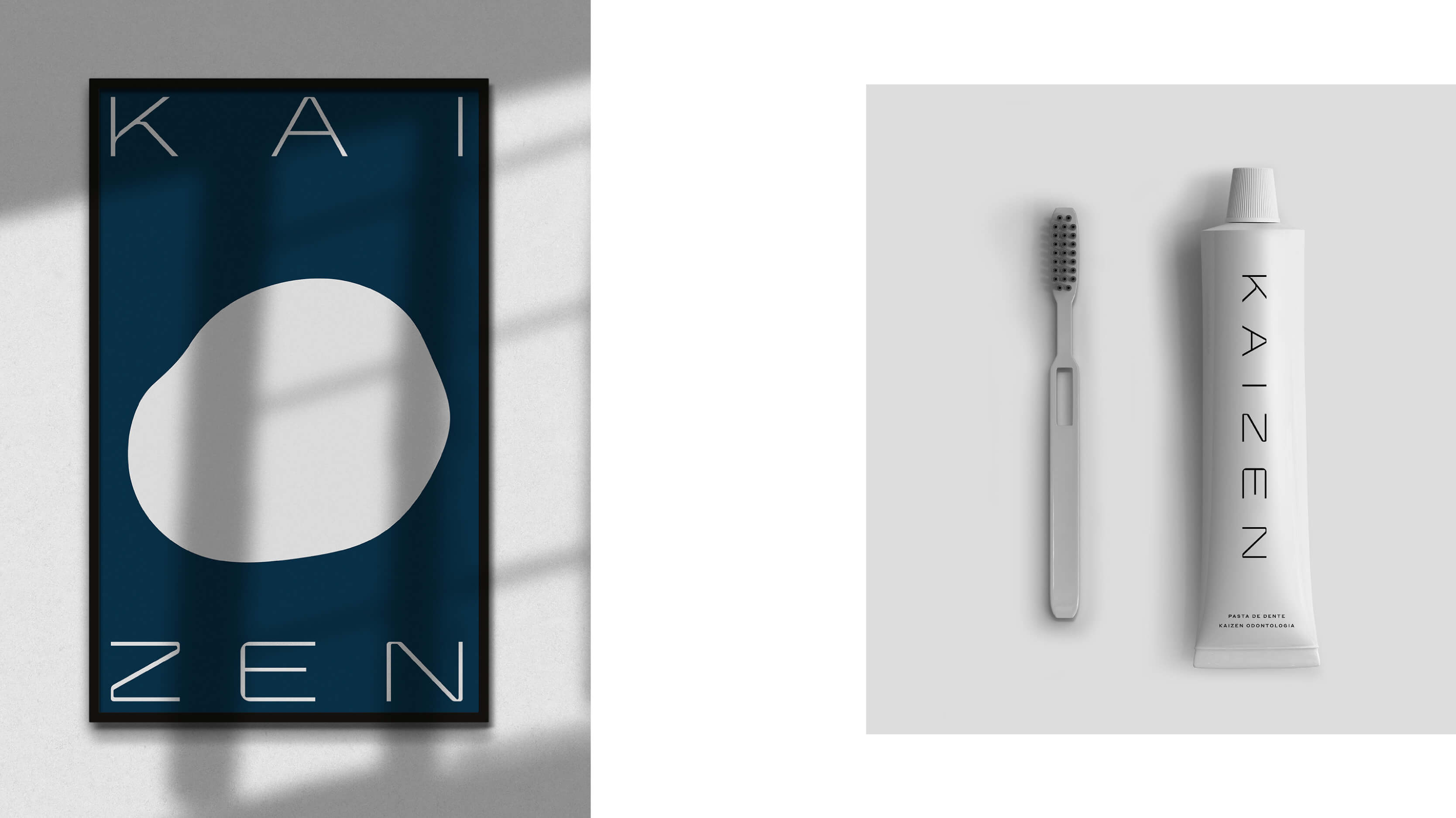
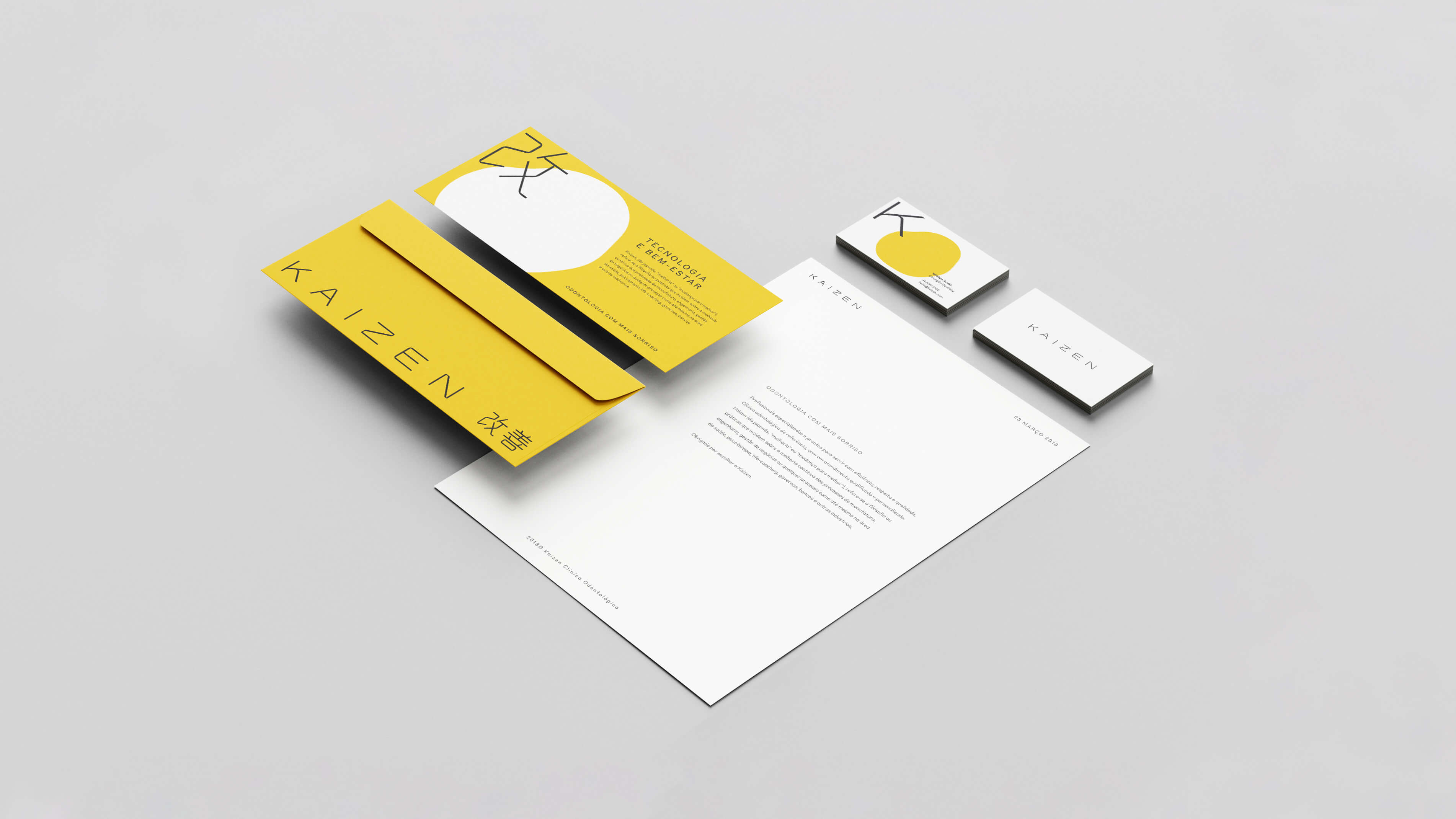
For the Kaizen rebranding, the company wanted to appear modern and technological, attract new customers, and maintain its already established base of clients.
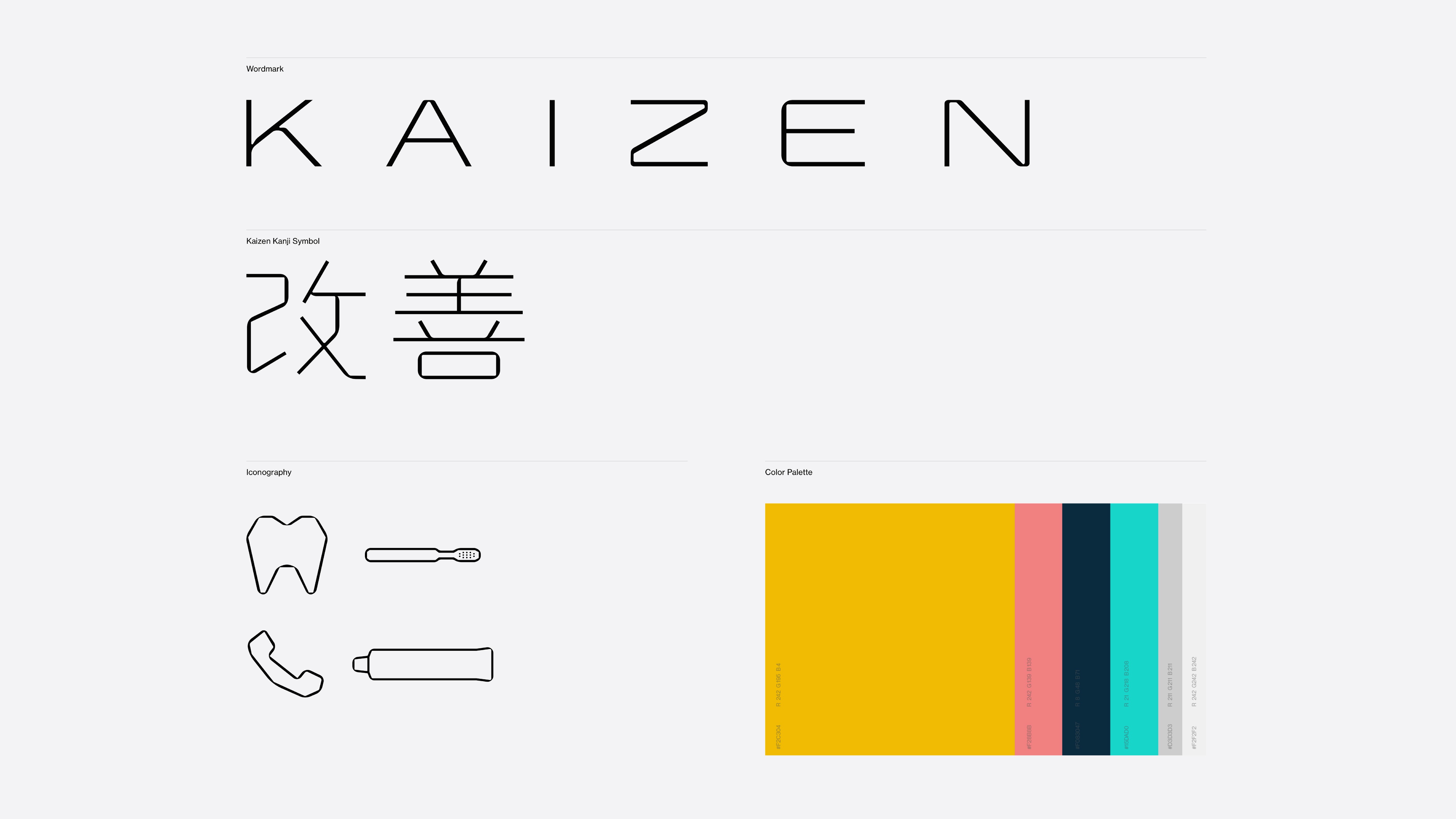
To do that, the path chosen for the rebrand was to mix the founders' Japanese ancestry with their Brazilian upbringing. The result is a logo, iconography, and typography indicating Japanese precision, simplicity, and technological aspects, with an organic and fluid color palette and shapes, nodding both to Brazilian empathy, warmth, and hospitality and Japanese Zen and Wabi-sabi culture.client base

"Good design is a language, not a style."
