services
Creative Direction
client
TODA Architecture
credits
(creative director)
Erick Donate
(agency)
(designer)
Marcelo de Costa
TODA Visual Identity
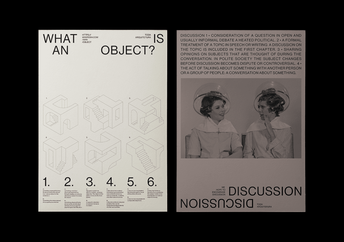
Based in Curitiba-Brazil, TODA Architecture is a unique boutique architecture office focused on developing projects with meaningful purposes. TODA is the abbreviation for Territory, Object, Discussion, and Architecture. The company was founded by the Canadian/Brazilian architect Derek Orlandi, who studied at the Escola da Cidade (School of the City), one of the best architecture universities in Brazil. The institution is a center of studies that seeks to introduce and reinterpret the different forms of occupation of space through the relationship between architecture, history, culture, territory, and nature.
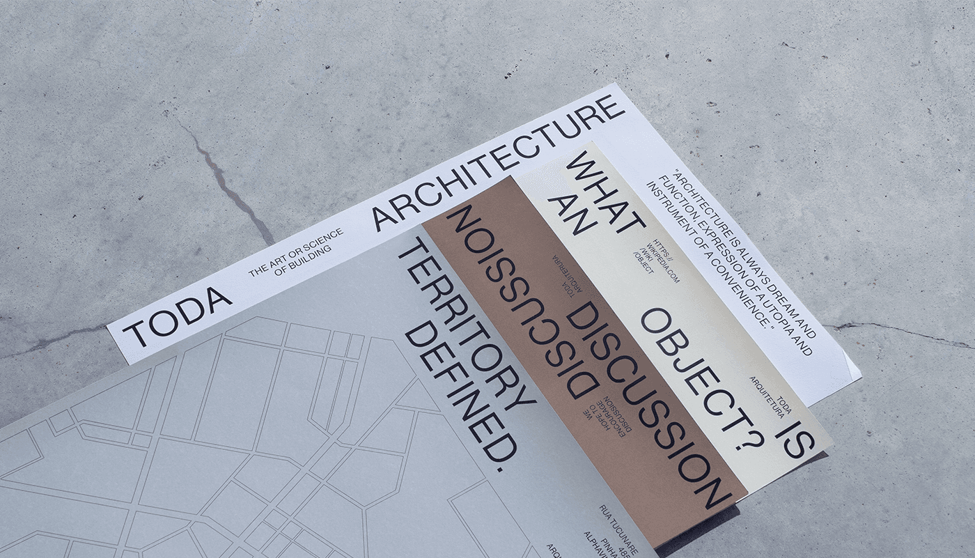
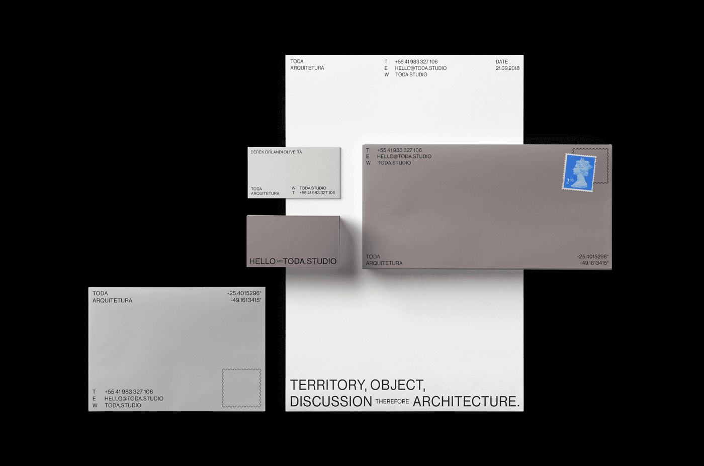
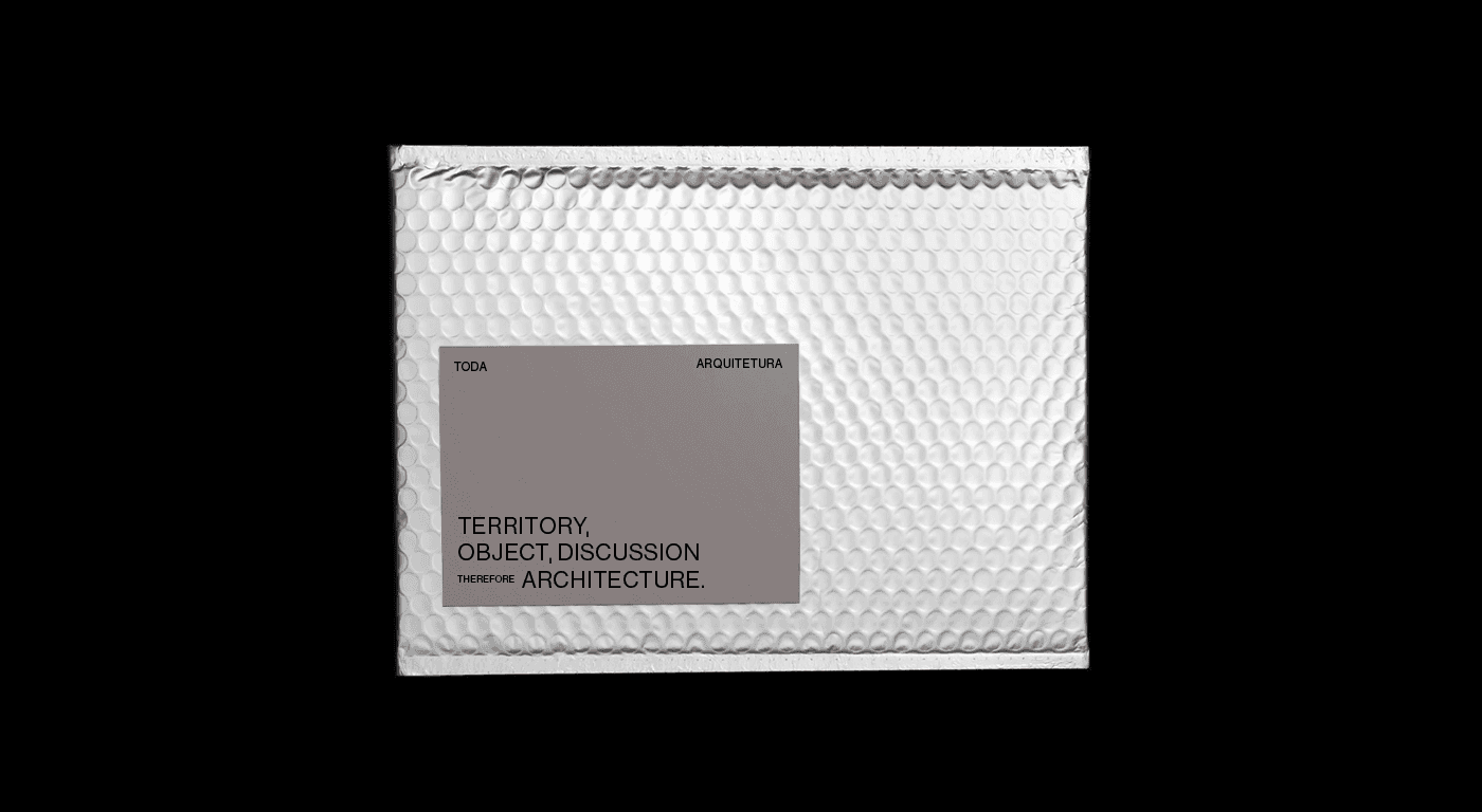
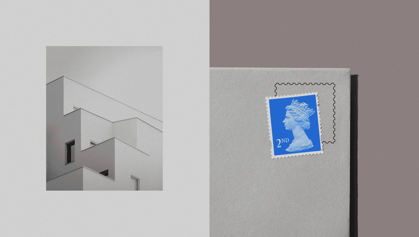
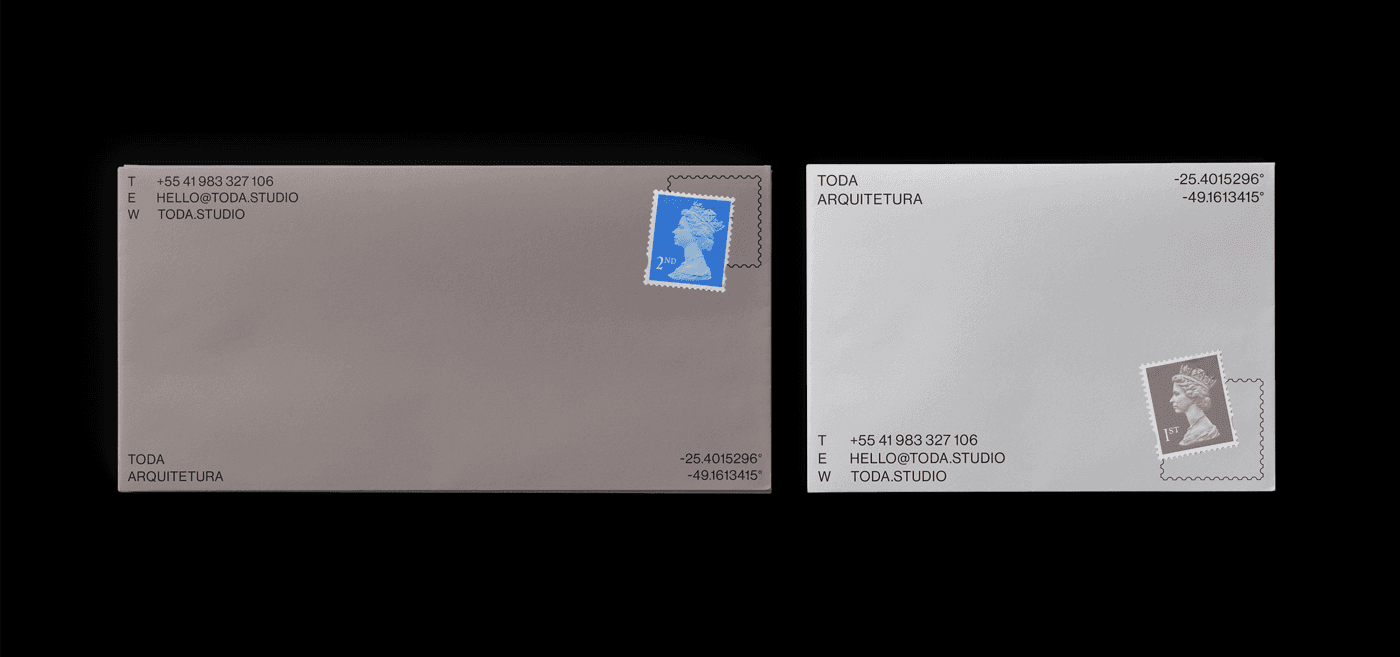
With such a mighty name, the company identity needs to be relevant and one of a kind. With simple aesthetics and bold proportions, the visual appeal of the brand reveals the connection between the history behind the name and the real challenges of an architect, representing the results of their work with 3D objects that symbolize the ultimate focus of the job: to transform a territory with discussion creating a unique solution for a space with a defined purpose.
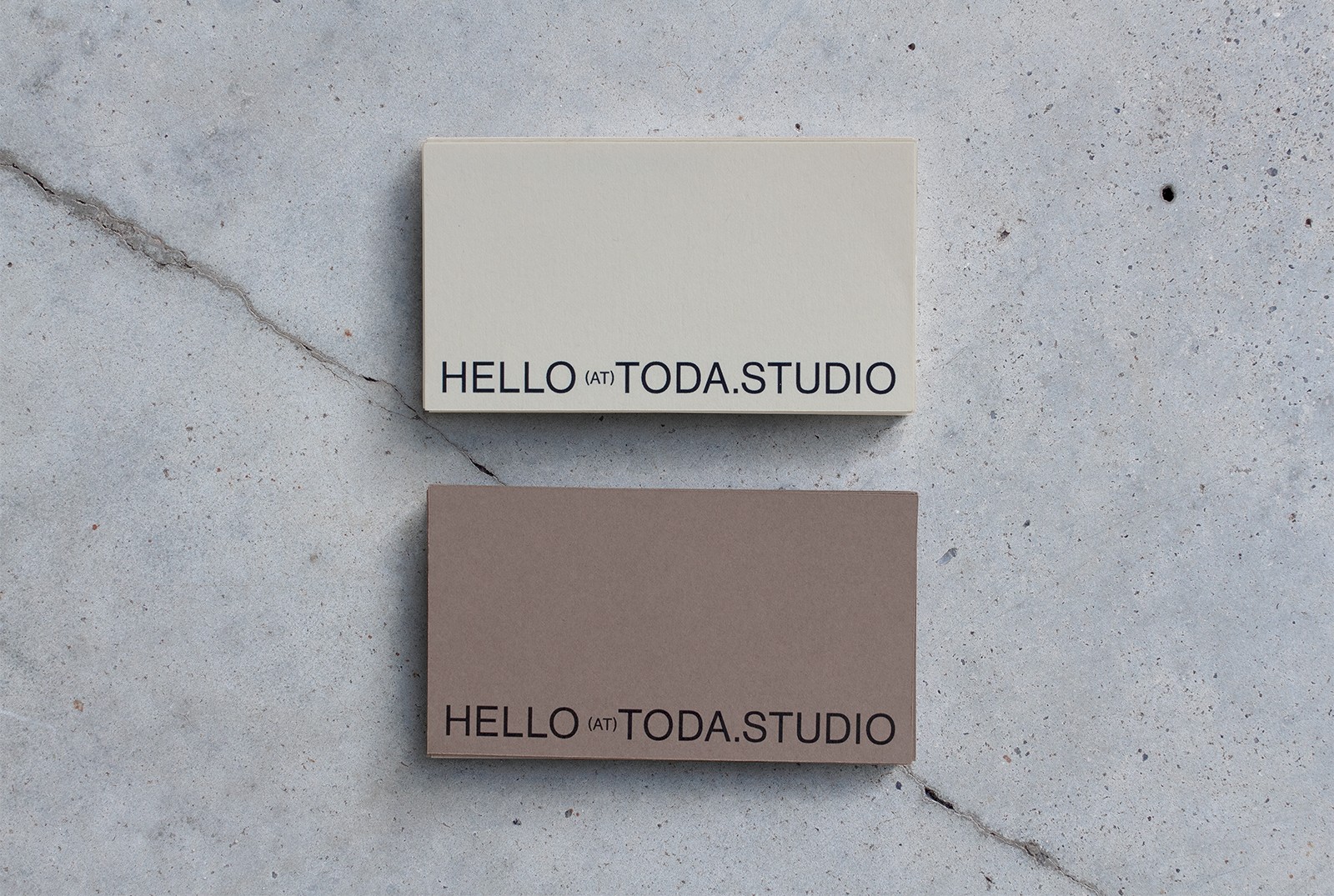
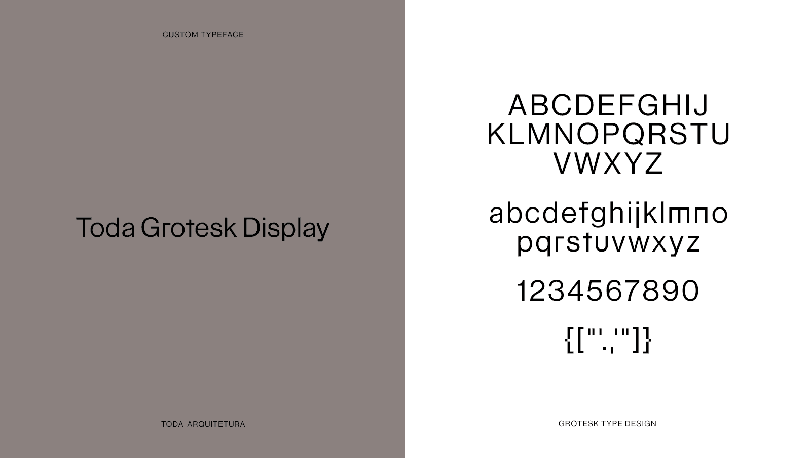
The custom typeface brings value and a particular feeling when observing the text, the kind of details that the meticulous work of architecture also carries. Besides the sobriety, the colors come from the various territories architects work with, bringing terrene and human aspects.
"Good design is a language, not a style."
